Statistical plots in clinical studies
Plot analysis is a unique feature in medical statistics, and is widely used in all aspects of data science. Here, several types of plot analysis are summarized, including the appearance, utility and implementations.
ROC plot
Beware! The ROC plot is always associated with a binary model!
The receiver operating plot is used in determining the performance of a discrete model. The horizontal axis is FPR, or 1-Specificity; the vertical axis is TPR, or Sensitivity.
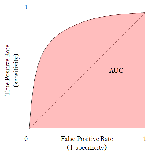
The area under curve (AUC) is calculated through integrating the area under the ROC curve. The curve could be calculated using scikit-learn.
sklearn.metrics.roc_curve(y_true, y_score, *, pos_label=None, sample_weight=None, drop_intermediate=True)
To statistically test whether two ROC are significantly different, the Delong’s test is often used. I have adapted a code for that.
Precision-recall curve
The precision-recall curve plots precision against recall. In fact, the horizontal axis Recall, which is equivalent to sensitivity. The vertical axis is Precision, which is equivalent to PPV. Unlike in the ROC plot, the baseline in the precision-recall curve is $\mathrm{Precision} = 0.5$.
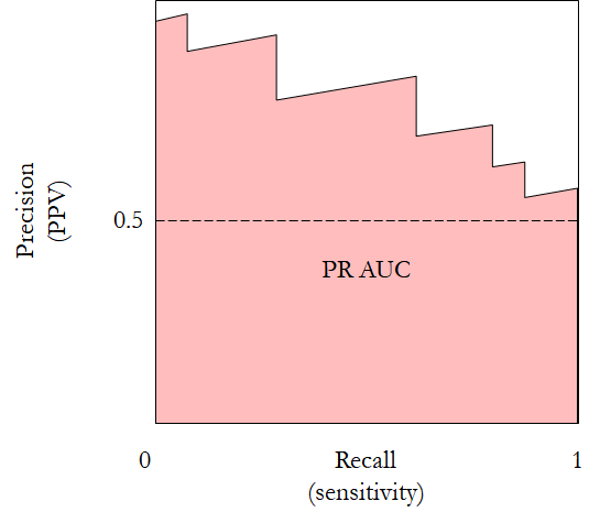
The precision-recall curve outperforms ROC in very unbalanced datasets. Its AUC is more sensitive with these datasets.
It can also be calculated using scikit-learn.
sklearn.metrics.precision_recall_curve(y_true, probas_pred, *, pos_label=None, sample_weight=None)
Bland-Altman plot
This plot is used for showing the agreement between two models on the same input. All inputs are run through the two methods, and the outputs are paired. Then the difference between each pair is plotted against their average. Simple.
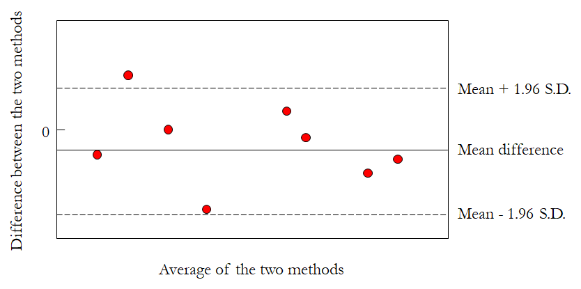
Bland-Altman can be conveniently generated by many types of software. OriginPro even provides a template for it.
QQ plot
To compare the sample distribution with the theoretical one, the QQ plot could be used.
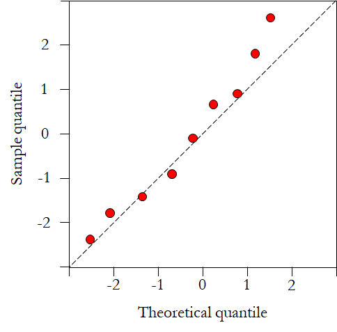
The QQ plot can be generated by python using scipy.stats.probplot() in scipy, or statsmodels.graphics.gofplots.qqplot in statsmodel.
Calibration curve
There is not much to say about the calibration curve. However, only continuous predictions, or a continuous agent of the discrete variable, can be plotted.
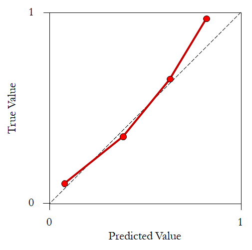
More information can be found in the reference 1.
Nomogram
Nomogram is a somewhat complicated analysis technique in medical statistics, it is associated with multivariate regression analysis, often generalized linear model.
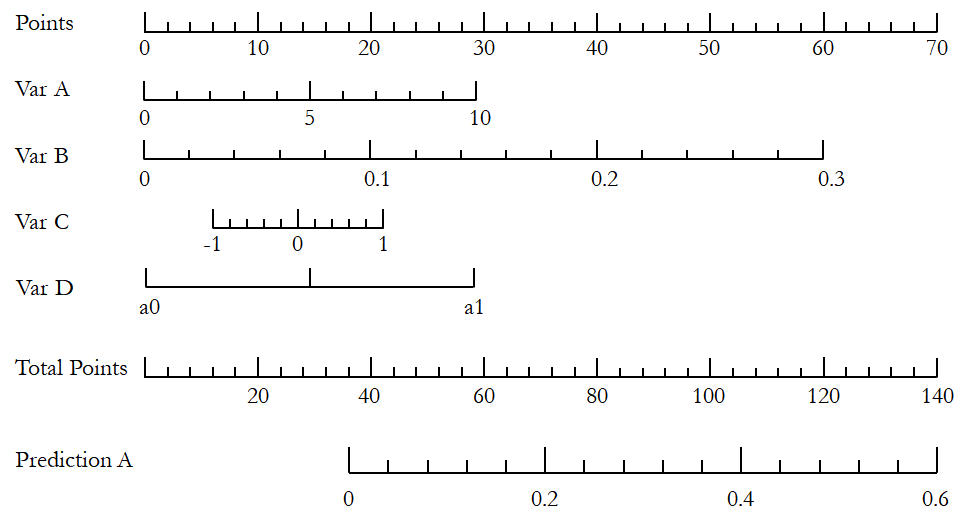
Although there is a python package (PyNomo) to generate virtually any type of nomogram, the most convenient practice is to use R (rms).
Decision curve
The decision curve also works with the predictive model. It first introduces the concept of “Net benefit” ($\mathrm{NB}$).
\[\mathrm{NB} = \frac{\mathrm{TP}}{N} - \frac{\mathrm{FP}}{N}\frac{p_t}{1-p_t}\]where $N$ is the total sample size, and $p_t$ is a threshold probability of the positive rate of a patient. The first part describes the overall benefit of the intervention, while the latter part describes the harm. The horizontal axis is the threshold probability.
First, two reference lines corresponding to intervention for none and intervention for all are drawn. Then, the model curve is also depicted, by adjusting $p_t$. According to literatures, $p_t$ is the predicted risk probability in a continuous predictive model; and it can be the cut-off value in a binary predictive model. Once the model parameter is fixed, TP and FP can be calculated and then the net benefit.
More information about the decision curve analysis can be found here.
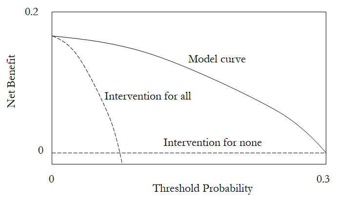
The decision curve analysis can be implemented by R, through the dcurves package.
The decision curve analysis is not very straight-forward, and has been actively promoted by the clinical statistics community. Many publications introducing this technique can be consulted.
Forest plot
Forest plot is often associated with meta analysis and systematic reviews. However, it can be used to compare the risk factors in many different scenarios.
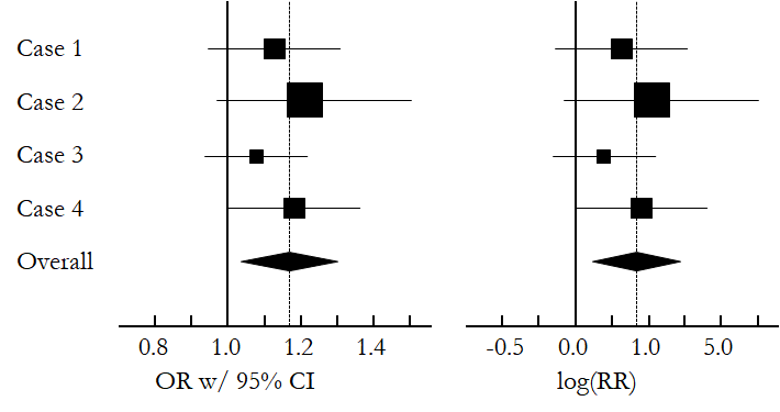
In python, statsmodels can be used to conduct meta analysis and draw forest plot. However, the appearance is kind of strange. The forestplot seems to be more convenient. OriginPro has a custom template file here.
Survival plot
Survival plot is used to show the number of patients survive against time. Survival data can be used to conduct survival analysis. One of the fundamental concept in survival analysis is the Cox regression, named after the recently deceased statistician Sir David Cox.
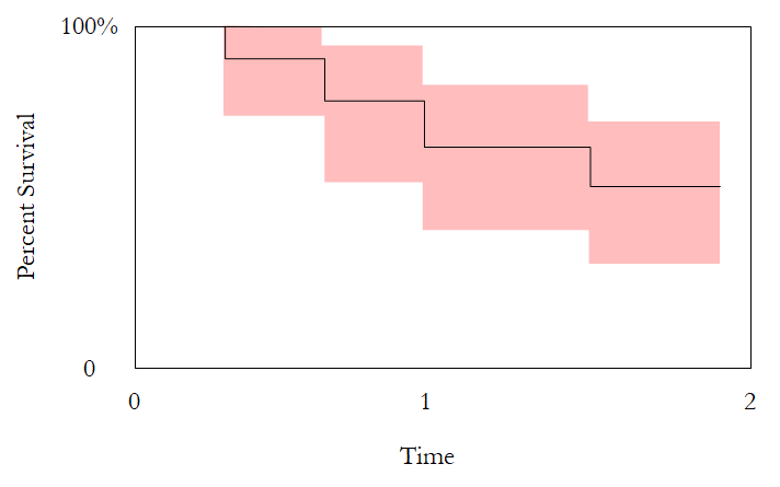
Survival plots can be generated in R using the ggplot2 package. See this post for detailed information.
Resources
1. Van Calster, Ben, et al. “Calibration: the Achilles heel of predictive analytics.” BMC medicine 17.1 (2019): 1-7.